
How to Add Custom Layout Types on Your Website with WP Social Ninja
Do you know?
38% of people will stop engaging with a website if the content/layout types are unattractive.
– Hubspot
In order to survive in this competitive virtual world, you have to pay extra effort to stand out in the crowd. You may be constantly updating your products and services, but your website needs to keep up with the changing time as well!
There are many essential factors like contents, designs, images, colors, and CTA, but without templates and layout types, your website will become a boring wall of texts and a few links. The first impression is often the last one, so in most cases, the website is the only opportunity for the customers to perceive your brand image. And if it doesn’t entice the users, they’ll probably never come back again.
Surely, a complex and unorganized website layout will decrease your website visitor rate. Moreover, they will do negative word of mouth marketing, and it might break your label. So our WP Social Ninja team understands the need for a wholesome website to make a brand.
To help, we have created this blog for you to know more about custom layout types.
Ready? Let’s go!
Why do you need layout types on your website?
Online research about products and services is a common thing today. Especially the millennials and Gen Z spend a lot of time online and like to know about brands. Well, the baby boomers are also learning how to look for something online. But not everyone is tech-savvy. Some users surely can manage to find the website, but they can’t go further than this. Sometimes complex design and layouts confuse the users and they feel lost even if they are still on the home page.
Moreover, brands also need to understand where you need to stop showing off the testimonials and offer some useful information to help catch the user’s attention.

To be precise, it’s a huge struggle to figure out where the brands need to draw the line to properly use the limited webspace and provide all the insights to the website visitors. Because you would like them to know what your satisfied customers are praising about you, on the other hand, you need to tell a lot of things within a limited frame.
Furthermore, there are plenty of reasons that a website should carefully select the templates and layout types. Let’s see-
Improves user experience
An organized layout style means the content is well put together without wasting page space. Moreover, layouts with sufficient text deliver a clear message about the products and services. So the users understand quickly about the business and connect asap.
This way, your visitors leave the webpage with what they were looking for, and chances are high they will come back again.
It makes content more readable
An informative website is still miles behind to seal the deal without readability optimization. So once your content is ready, you should focus on the templates and layouts because lengthy texts will kill the interest of readers.
Appropriate space throughout the pages and a layout that compliments the design will make a readable website that can bring a lot of conversion rates.
Creates a stunning visual representation
A perfect layout improves the brand value and offers visual stability. Think about the best-designed websites that you have visited so far, aren’t all of those visually attractive?
Well, it’s not just because of the colors and images. Stylish and elegant layout types, templates make a lot of difference on the web pages. Moreover, it improves website traffic and user engagement too.
It says a lot about the brand
Knowingly or unknowingly, when we browse a site, the layouts help users understand the gist of the page without even going through details. So not just for a well representation or style purpose, layouts and templates tell about your brand and build an instant bond between brands and the visitors.
Web page layout types are one of the essential elements of a wholesome website. But how would you know how to create an easily navigable, informative, and elegant site with the most incredible template and layouts?
Let’s jump to the next segment.
How to add custom layout types to your website
You must be wondering how to add custom layout types and what the functionalities are. So let’s see what the best social media plugin, WP Social Ninja, has in store.
With four most popular layout styles WP Social Ninja offers:
- Grid
- Slider
- Masonry
- Badge
The grid layout contains a number of columns, and each column contains the content you want to display. Columns can span across multiple grid lines and can be offset from each other.
Moreover, you can give it a new outlook with the templates available on the WPSN dashboard.
A slider is a design element that displays images and videos on your website. It is a slideshow showing images or videos one after another. WP Social Ninja allows you to place sliders on your home page, landing pages, posts, blogs, anywhere you want it to be displayed on your site.
And after you enable the Slider layout, you can also pick any template to change the traditional look!
Next is the Masonry layout type. It is a layout based on columns that do not contain a fixed height for rows. You can place your content based on the vertical space available without a row height requirement.
Masonry lets you maximize the web space and utilize reviews, images, and other different-sized content in the most beautiful way. Furthermore, you can select suitable template types and decorate your site a little more.
The fourth layout type is a user-requested feature with a separate settings panel. Yes, we are talking about Badge layout style. It’s a neat feature on your site to save the web page space while simultaneously showing all the valuable reviews.
For example, web pages full of reviews and ratings might irritate visitors. The visitor is probably looking for something, and the floating reviews keep distracting. Moreover, abundant testimonials might kill all the web space with tons of important information to display.
WP Social Ninja dashboard has a detailed Badge filter section. So while choosing the layout, you can set some changes too.
First of all, from two types of Badge, you can pick any that goes well with your brand. Next, change the Badge position from Float Left Bottom to Float Right Bottom. Moreover, deep customization from the settings panel helps represent your reviews in an organized way. Adjust your Display Platform Icon, Display Title, Custom Title.
We have two important functions; Display Number of Reviews, and Display Reviews in Popup. If you click on the Display Number of Reviews, the total review numbers will appear on the screen so the users can see how many reviews are there.
Finally, Display Reviews in Popup. If you enable the button and click on the Badge layout, a magic box will appear full of reviews. Your visitors can scroll down to view, and this way, you can exhibit the social proof in the most elegant way.
Notification Streams
Standing out with a competitive world becomes easier when a website has some sturdy layout types. Along with these, what if a popup feature Notification Streams is added to your site with the best social reviews your brand got throughout the time?
Sounds great, doesn’t it? On top of it, there is a dedicated settings bar where you can change and adjust the reviews and create a beautiful representation.
Let’s see how we can personalize a new Notification Stream within a few clicks. You need to go to the “Notification Streams” tab to design a template first.
Then, add a new stream to start designing a new Notification Stream.
Notification Settings
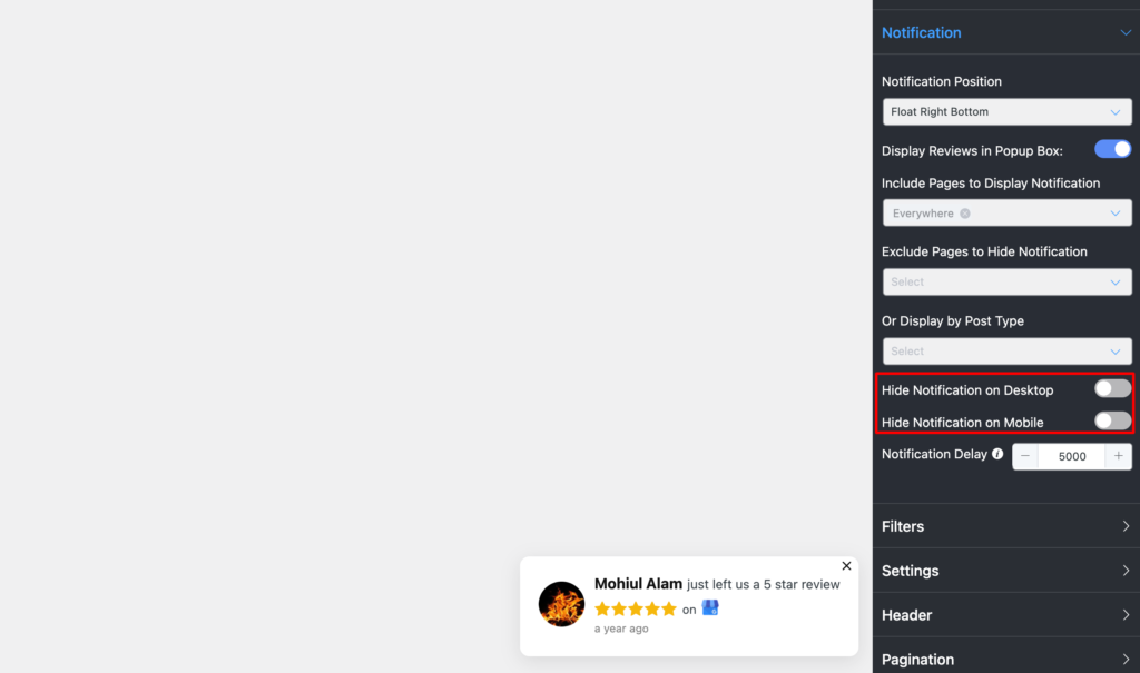
Go to the “Notification” tab from the sidebar and configure “Notification Positions”.
Select from Float Left Button to Float Right Button to display your popup on the webpage.
If you want your customers to see all the reviews when they click on the pop-up, enable the “Display Reviews on Click” button. In case, if you don’t want to show reviews on click, then disable the option.
Next is “Include Pages to Display Notifications”. Here, you need to select the pages from the dropdown of the option if you want to display reviews on specific pages.
If you don’t want to show reviews on a specific page, then simply select the pages from the dropdown list of “Exclude Pages to Hide Notification” options.
Again, if you want to show reviews by different post types, then choose from the dropdown of the “Display by Post Types” option.
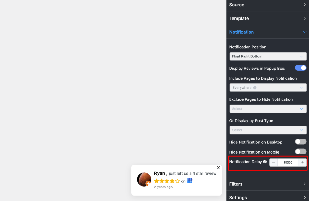
If you don’t want to show reviews either on desktop or mobile devices or both, then just enable the options “Hide Notifications on Desktop” or “Hide Notifications on Mobile”. In case you want to show reviews either on desktop or mobile devices or both, then just disable the option.
Set the time interval according to your taste to show reviews on the pop-up through the “Notification Delay” options. The minimum time interval will be two milliseconds. You always change it to your likings.
Now you can set up your “Filters”, “Settings”, “Header”, “Pagination”, and “Schema Snippet” settings just like you will do with any other template style.
And there you go!
Final takeaway
While creating a website, your focus will be on many things. But, how you’re presenting your content is a crucial part. And we are not just talking about the appearance, design, color, and copy here. The layout types, templates are equally important too. It creates a top-notch online presence and delivers brand information to your web visitors in the most stylish way possible.
We hope the article was sufficient enough for you for a better understanding. Check out our other blogs to know about the wide range of WP Social Ninja-

Subscribe To Get
Weekly Email Newsletter
Connect, Customize, and Display Social Feeds, Reviews, and Chat widgets




Leave a Reply