Changing the styles of Feeds and Reviews is a fascinating task. WP Social Ninja provides comprehensive website styling with multiple functionalities. You no longer need to use a Custom CSS code or page builder to decorate your feeds or reviews; you can instead do so directly from the WP Social Ninja dashboard.
Feeds #
Let’s look at how you can style your feed template in a matter of seconds by reading this article.
- From the right sidebar, beside the General option, you will get a new feature: Style (Pro).
- Click on the Enable Style button, and a drop-down menu will appear.
- In this part, there are five style sections; Header, Name, Meta, Content, and Action.
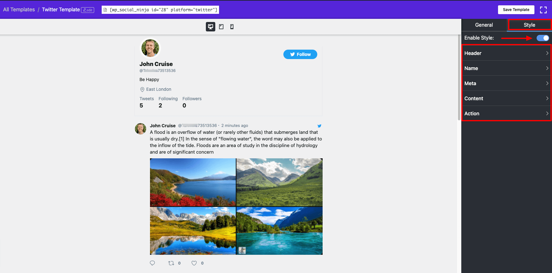
- Here, by going to the Header option, you will get the Name, Description, Location, Follow Button, etc.
- WP Social Ninja has unlimited color options in the palette, and you can pick any color according to your desire. You can also change the typography by clicking on this option.
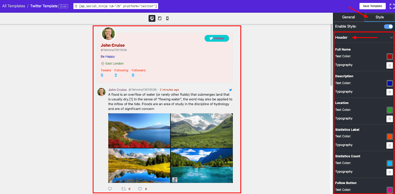
- Like, Header, you can also change the Name, Meta, Content, and Action as per your requirements.
Reviews #
Let’s now take a look at how this article can help you quickly style your review template.
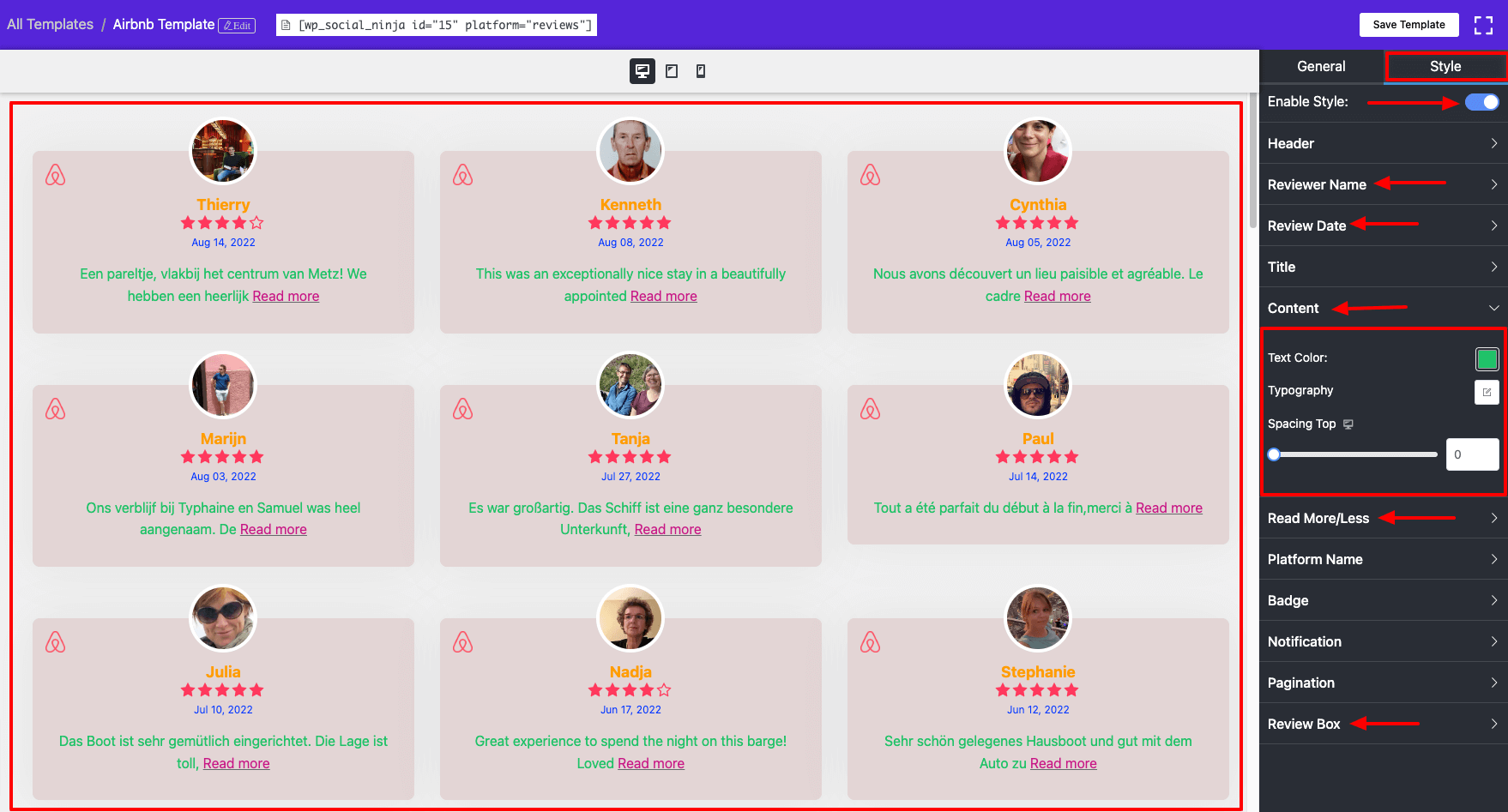
- As you know, besides the General Option, the Style ( Pro ) feature is available. When you click the Enable Style button, a drop-down menu will appear.
- Many style options are available in this section, including Header, Reviewer Name, Review Date, Title, Content, Read More/Less, Platform Name, Badge, Notification, Pagination, and Review Box.
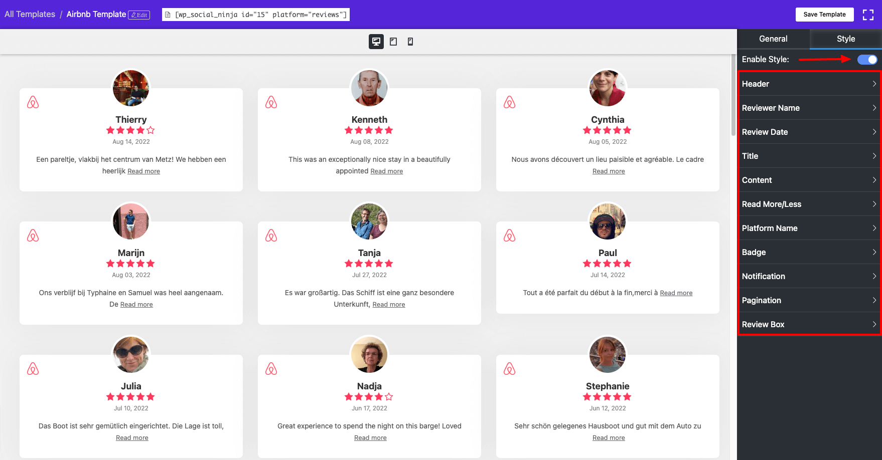
- The Reviewer Name, Review Date, Content, Read More / less & Review Box’s color and typography have all been changed in this scenario. WP Social Ninja has many options for enhancing your templates to be more appealing and relevant to your website.
Responsive Device Breakpoints #
Every customer wants their website to be compatible across all platforms, whether the user is using a desktop, tablet, mobile device, or wide-screen screen.
WP Social Ninja has upgraded the website styling functionality and adapted the layout to the environment in which it is viewed.
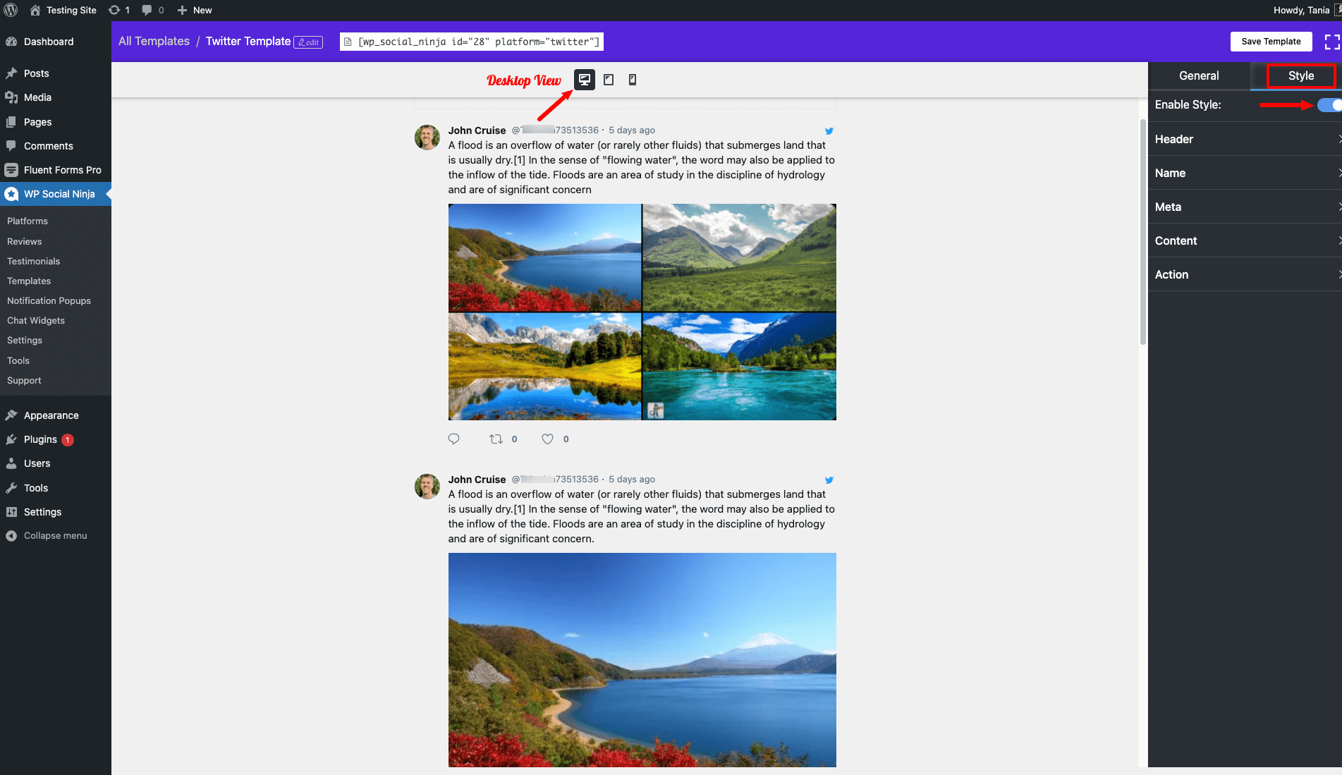
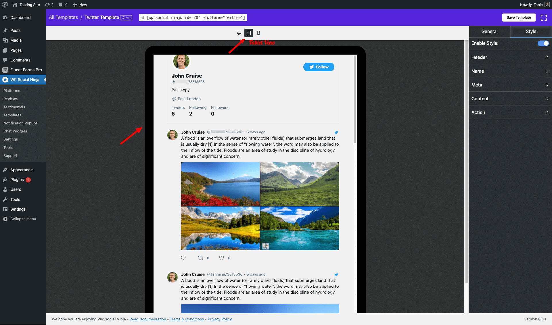
- The responsive device option is now available here, instructing the browser on how to change the page to the width of each device.
- Desktop, Tablet, and Mobile views are available here.
- Simply click on the Device icon, and each of the devices will allow you to adjust your template style.
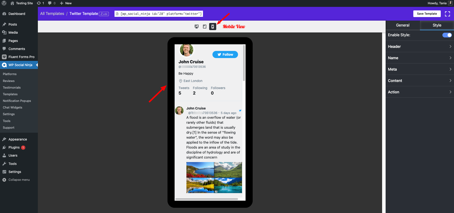
- Don’t forget to click on the Save Templates button when you are done styling.
Responsive Device options are also available for the Review Template.


